
Role: Branding, Art Direction
Credits: San Francisco 49ers - 2016
Overview
Sourdough Sam is the mascot for the San Francisco 49ers. He is seen on the field, during community events and of course on social media. However, Sourdough's brand was still non esxistent.
Sourdough Sam is the mascot for the San Francisco 49ers. He is seen on the field, during community events and of course on social media. However, Sourdough's brand was still non esxistent.
Objective
Create a flexible brand around the Sourdough Sam mascot that includes a logo, as well as a digital presence. This was the ask, however, I wanted to create something a bit more. I completely reimagined the Sourdough Sam brand and the opportunity it could create for the business. Not only could he have a brand, but he could also become a main character within the organization, creating marketable experiences around him that can generate additional partnerships across both digital and environmental touchpoints.
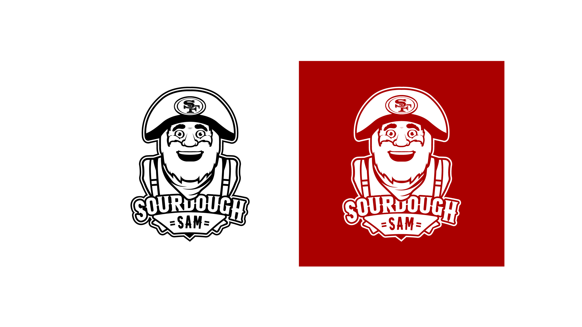
Primary Mascot Logo
Every mascot should have a brand mark that resembles the actual character, that being said, I started with the primary mark being an illustration bust of Sourdough Sam to capture his energy and presence with fans. This logo was built to commonly work in multiple colorways including a very popular one-color solution for fan give-a-ways.

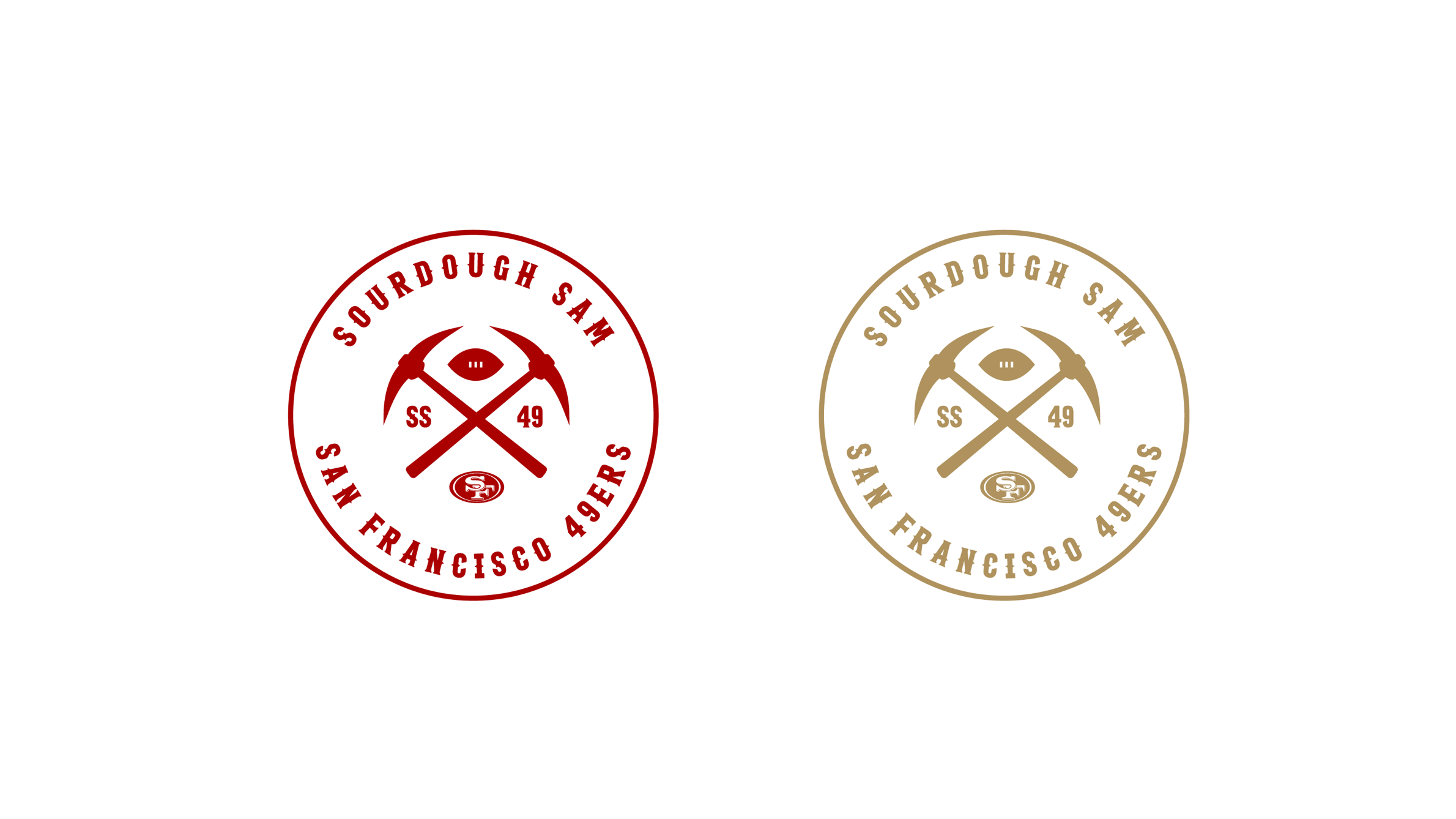
Secondary Logo - The Patch
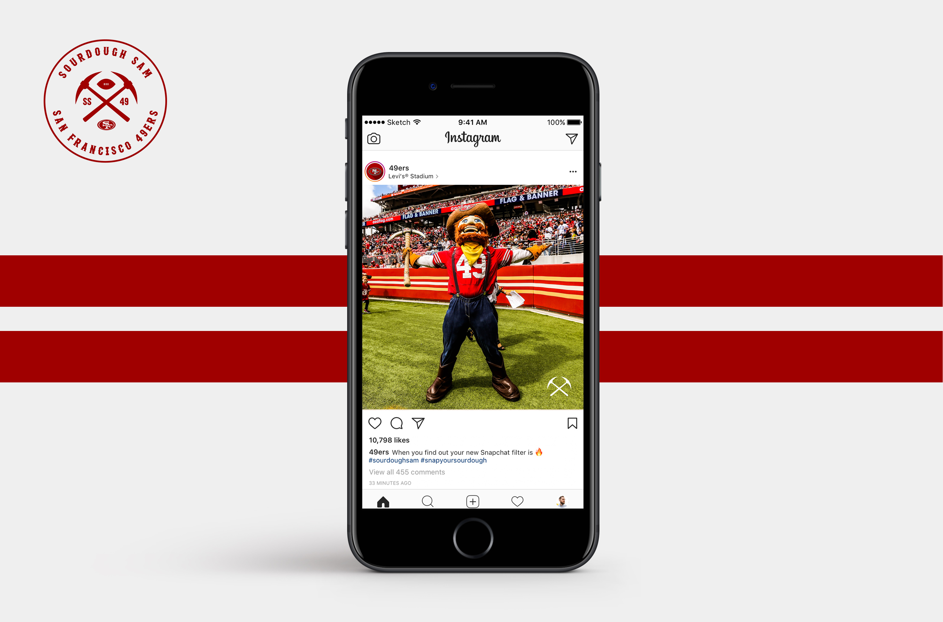
The second evolution I created for the Sourdough Sam brand was a path brand mark that could be used on apparel, bags, hats, stadium graphics and even a stamp. The logo uses the same typography treatment as the primary logo and inlcudes the 49ers oval, SS for Sourdough Sam, a simplified football and of course his famous pick axe. I really wanted this brand mark to less playful than the illustration to create a balance and enhance fan acceptance.

The Lockup
A scalabale brand should include elements within it that can both stand alone and together to create additional marks for specific applications. This is an example of further refining the brand to a simple pick axe and wordmark lockup. This mark works well for digital applications as well as decals, locker nameplate and even retail assets.
Both of these marks can be stripped down to stand along and also be used intentionally across the brand.
Step & Repeat
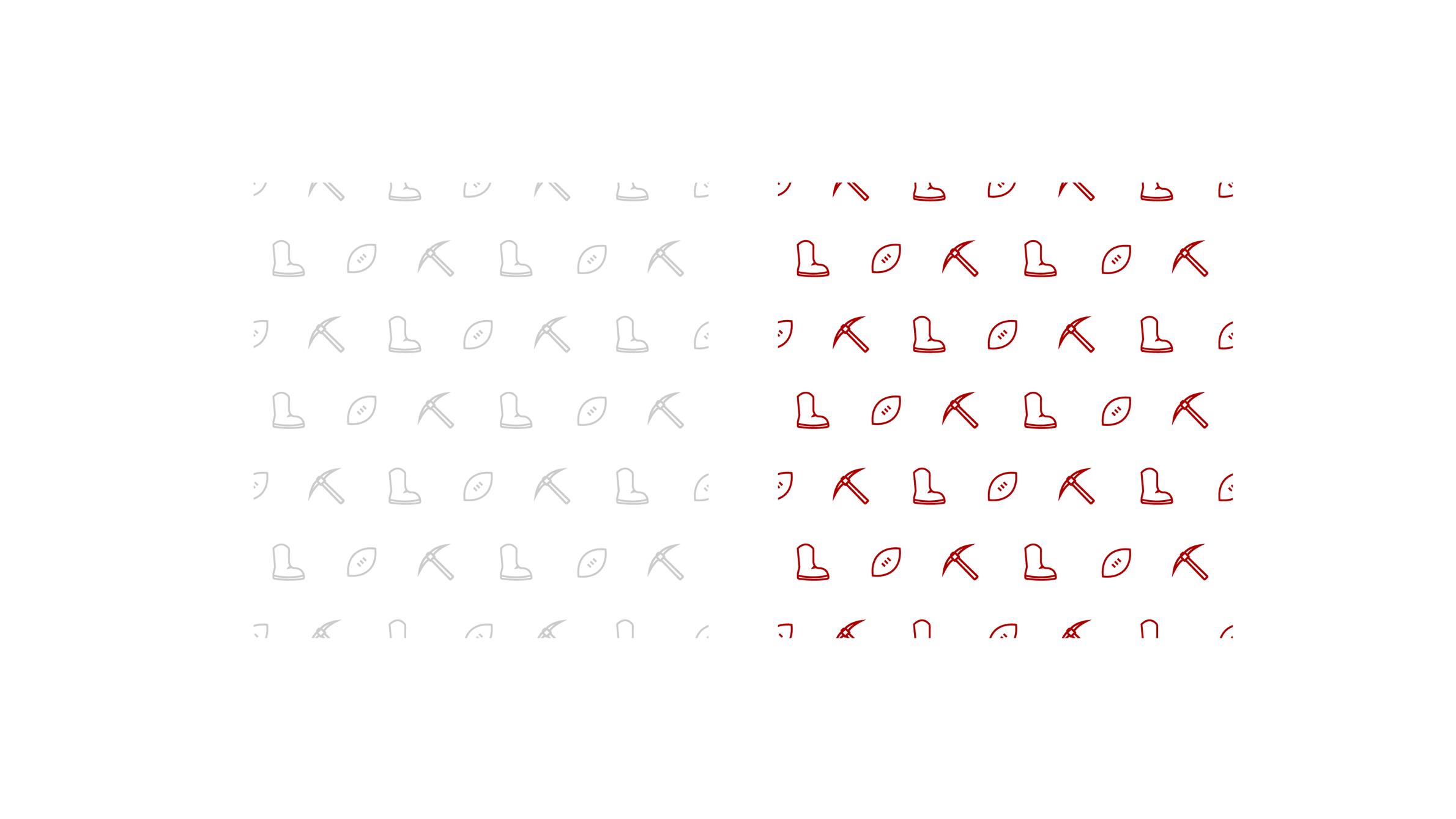
I wanted to create a pattern that was both playful and dimensional to be scalable at any size that could enhance the mascot brand. To do this, I pulled from his most well known features to establish as a repeating pattern that is designed to work automatically on design software as to also create efficiency within the design process itself.
Discover More Projects

Alexa TogetherMobile App
NomNomSaaS, Mobile, Responsive Web
MyTransUnion - DisputeMobile App, Responsive Web
AEG WorldwideResponsive Web
Credit CompassResponsive Web
MyTransUnion - Credit FreezeMobile App, Responsive Web