Role: UX/UI, Product Design, Art Direction
Credits: Hathway - 2016
Overview
Overview
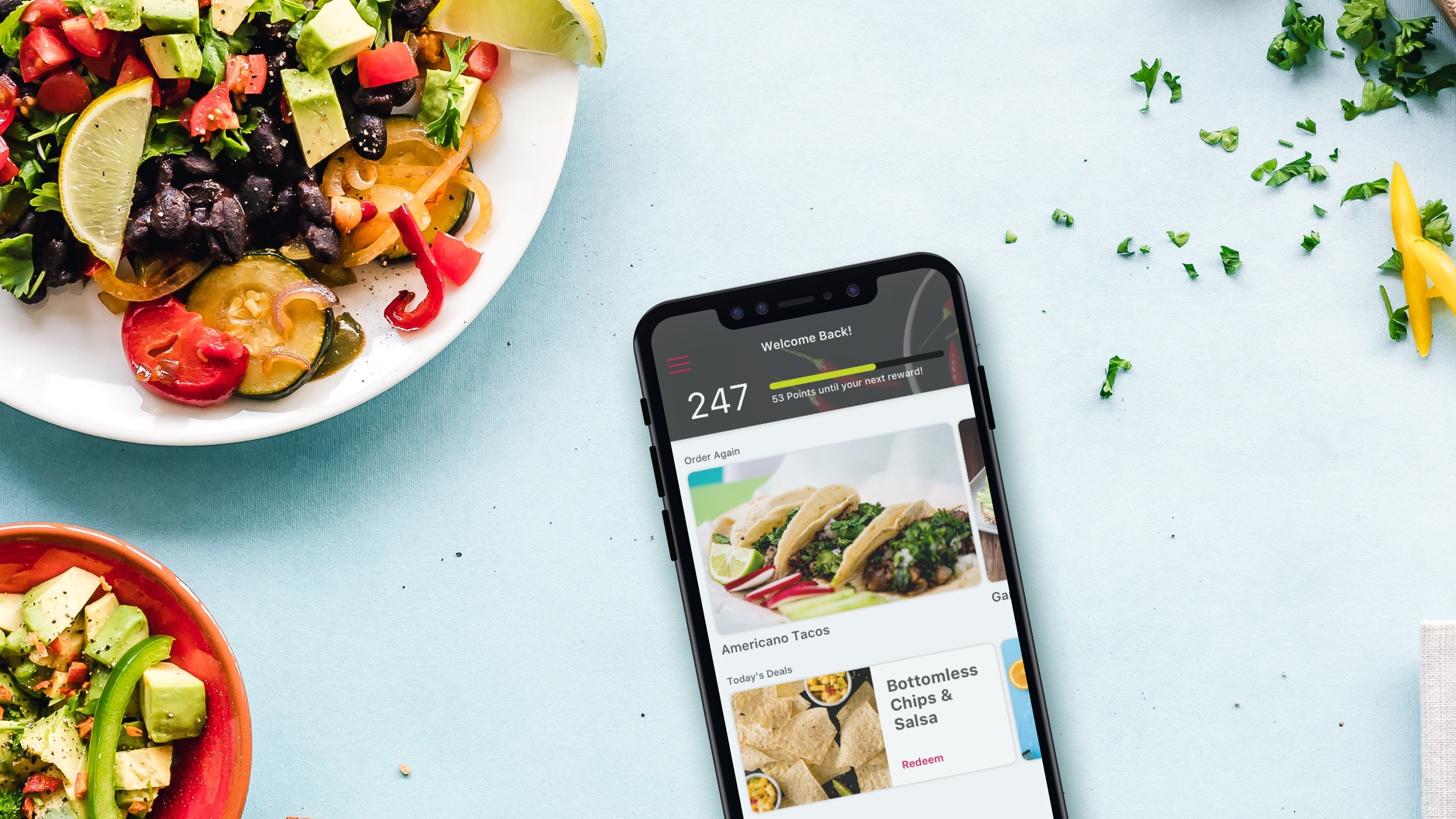
NomNom is a white-label, order ahead mobile-first platform that Hathway created to license to QSR (Quick Service Retail) clients like Applebees, IHOP, Peet's Coffee, Dair Queen and more. NomNom makes it easy for clients in the QSR space to quickly invest in an intuitive order ahead app that has a wide range of customizations. This allows those brands to launch a well designed and developed application for their users in a shorter amount of time than if they started from scratch, and for a smaller fee.
NomNom is a white-label, order ahead mobile-first platform that Hathway created to license to QSR (Quick Service Retail) clients like Applebees, IHOP, Peet's Coffee, Dair Queen and more. NomNom makes it easy for clients in the QSR space to quickly invest in an intuitive order ahead app that has a wide range of customizations. This allows those brands to launch a well designed and developed application for their users in a shorter amount of time than if they started from scratch, and for a smaller fee.
Objective
Create a white-label solution that can be licensed and customized according to the client. The mobile-first platform should include four major categories of functionality; Order Ahead, Loyalty Points & Rewards, Payment (including Apple Pay) and location based services. To do this, Hathway will form strategic partnerships with third party services to provide those four pillars of functionality. For efficiency in design and development, the design team is to create a manage a design system library for all assets as to be easily modified during production.
Order Flow Chart
Order Flow Chart
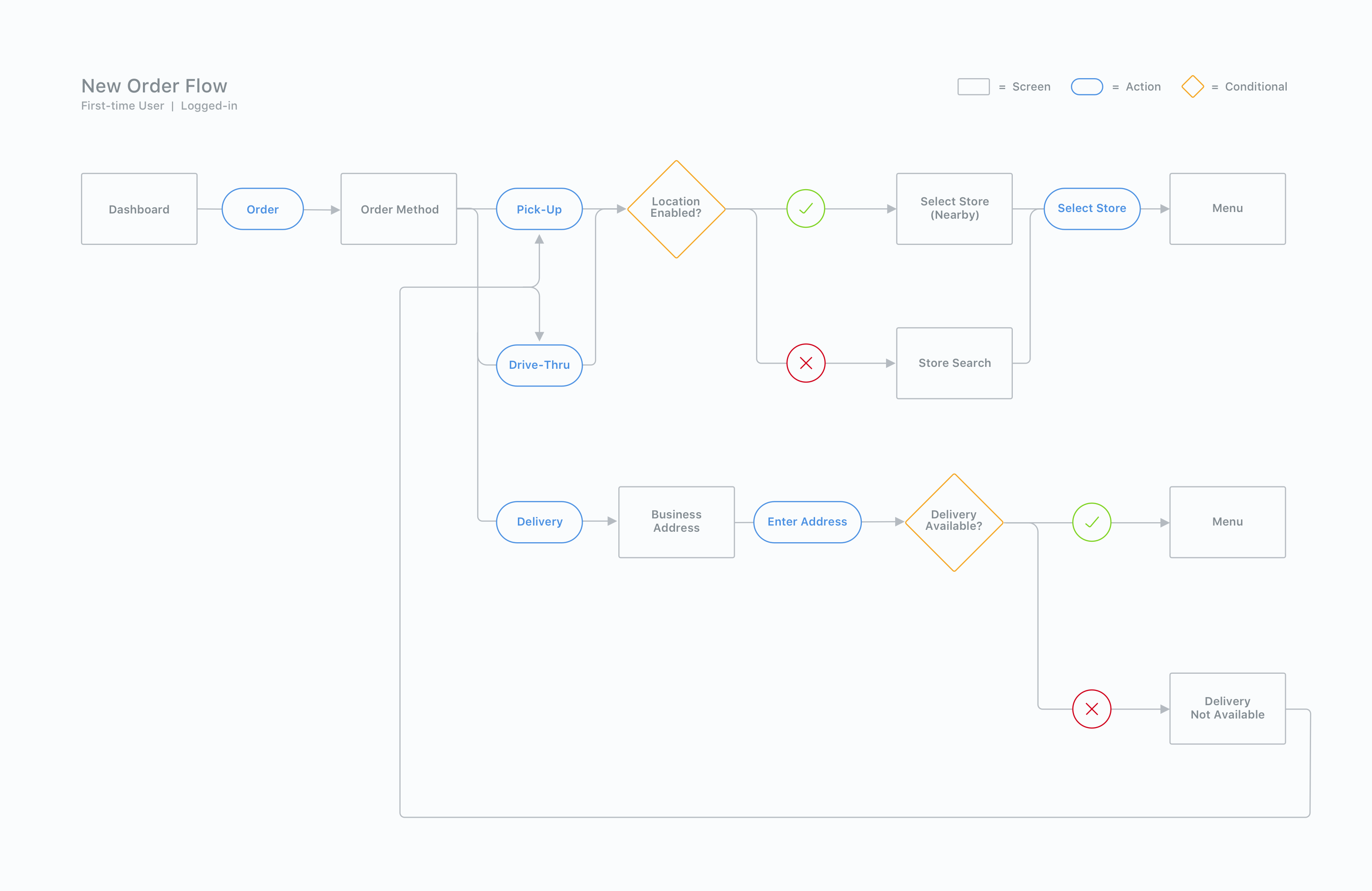
The order flow for the NomNom platform is arguably the most crucial pillar of functionality for the app as it will be the most heavily trafficked. The team spent months going back and fourth to find the optimal user path for ideal efficiency when ordering and allow the user to effortlessly complete their usertask of simply ordering their food.
Two main intersections that were carefully tested and examined include order types (Pick-up, Drive thru, Delivery), as well as location based information according to those order types. In other words, filtering the user to the stores that offer the type of order they are looking for up front rather than getting to the end of an order only to find out they cannot have it delivered. Below is the user flow that I identified as the most efficient.
Wireframes - Order Flow
Wireframes - Order Flow
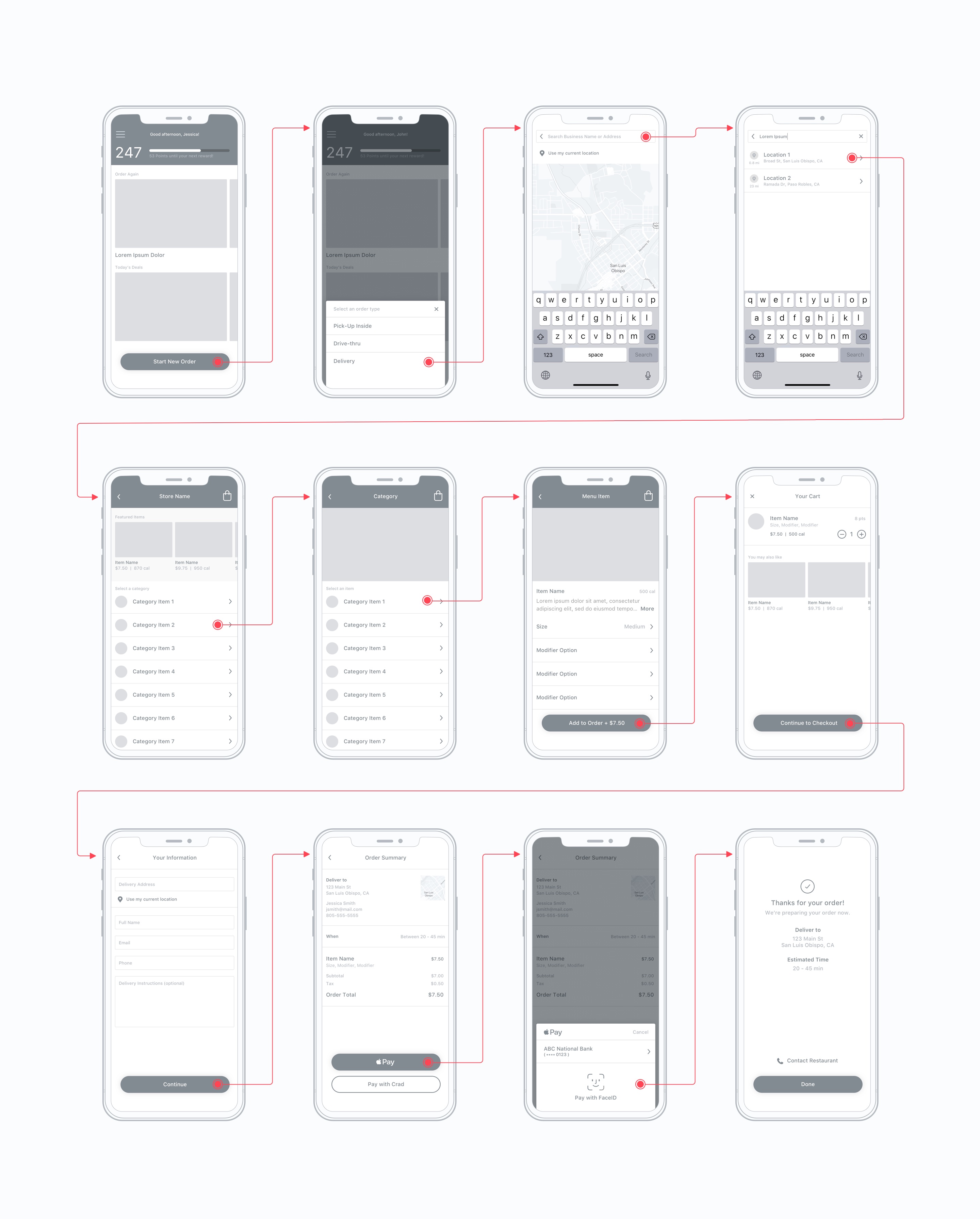
Once the happy path for the user flow was flushed out, I began wireframing the experience to include the four main pillars of functionality discussed above while also keeping in mind the customization that will be occuring. This required carefully laying a foundation for those sections and interactions so that if added or subtracted from the app during production, it would require minimal effort and not effect the overall UX of the experience.
Visual Design
Visual Design
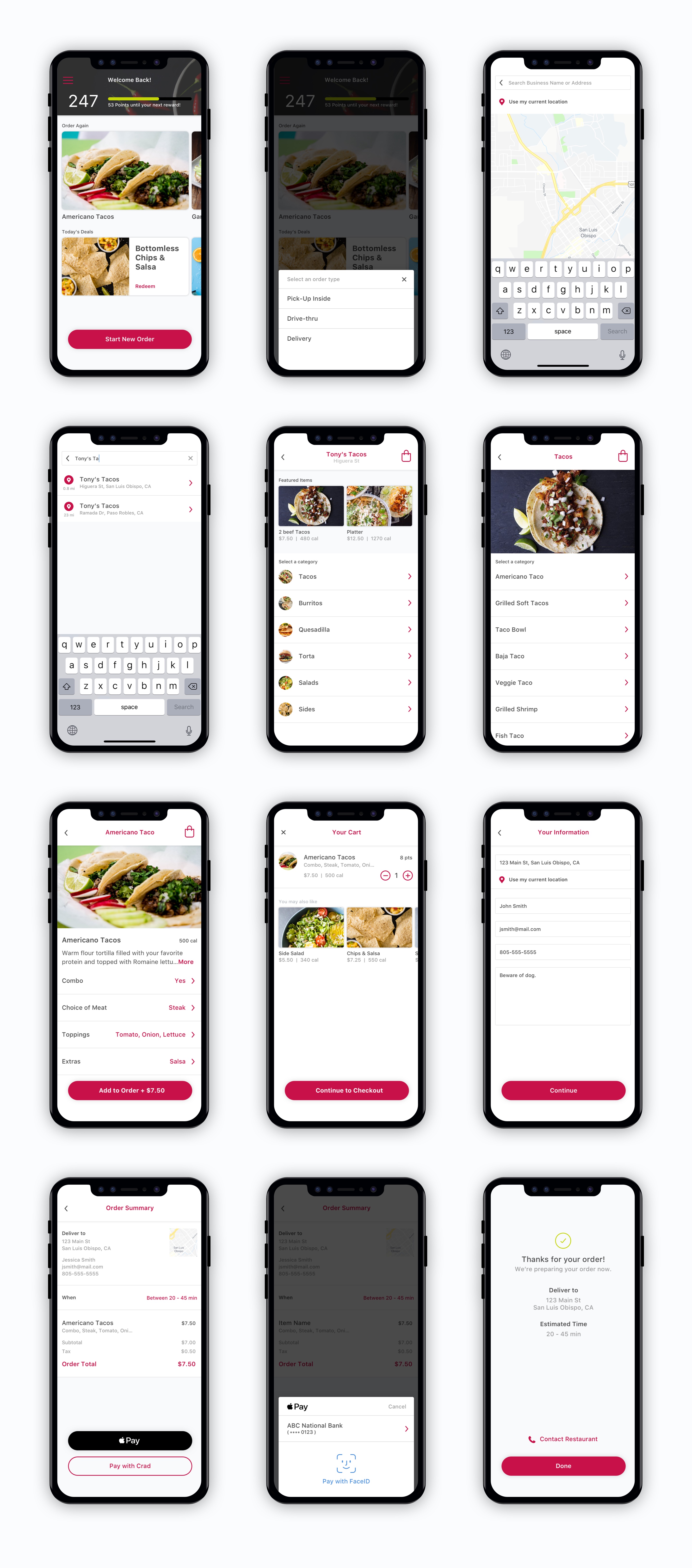
This is where the fun starts. Depending on what client is requesting NomNom services, the UI customizations can go as far as they are willing to pay for. This includes custom loyalty and rewards campaigns, progress tracking, data visualization etc. Another cornerstone to this app from a branding standpoint is content. The better quality images or media the client has, the better the app will present. To give a simple example, I created a moderately customized experience for a faux restaraunt called Tony's Tacos. Mostly because I love tacos...who doesn't .
Launched NomNom Products
Launched NomNom Products
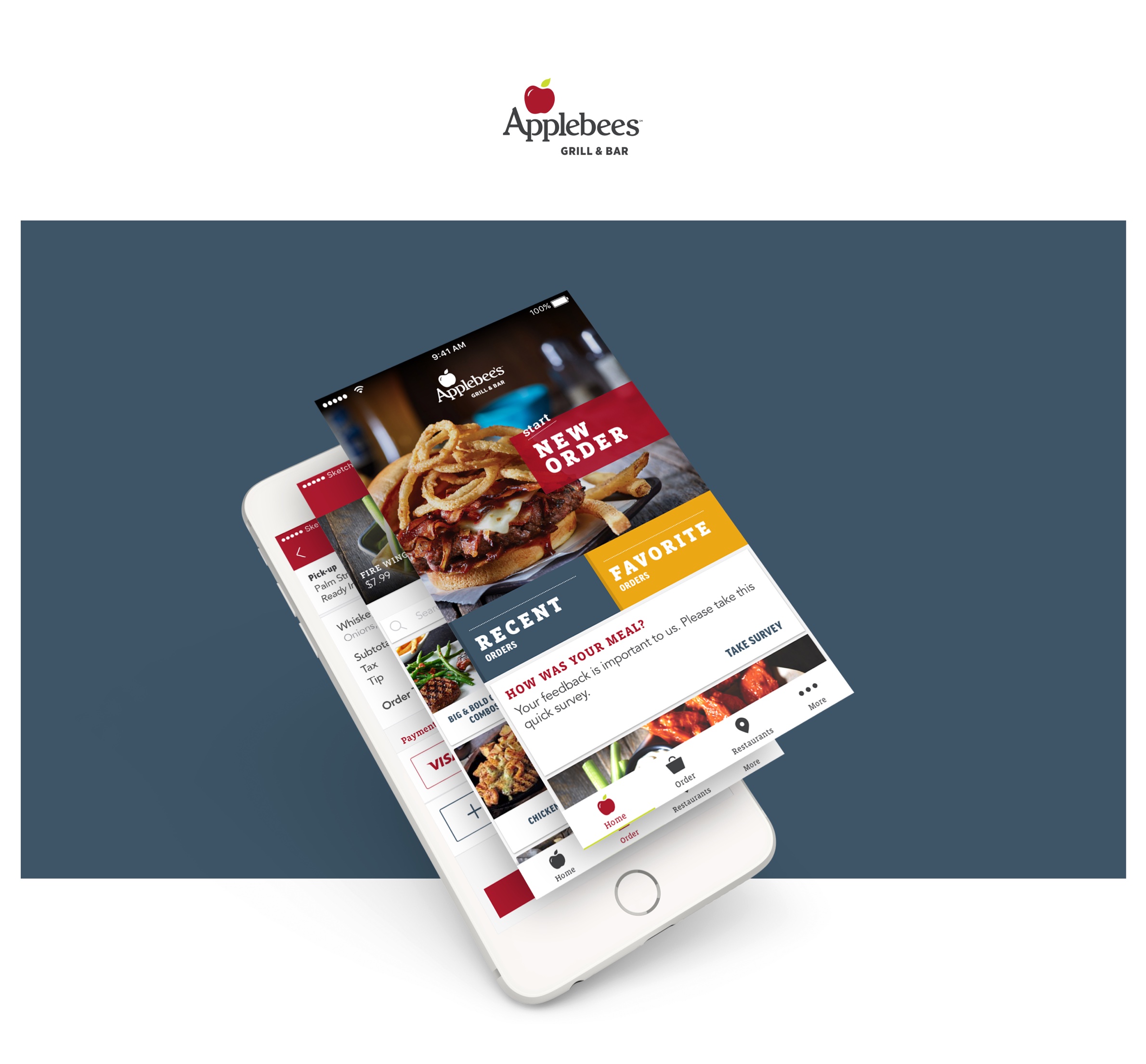
With the client list growing rapidly for the NomNom product, there are only a couple that have launched and promoted the app on a national scale. Applebees is one of the clients I had the pleasure of working with on their order ahead app using our NomNom solution. Below is the app commercial they launched to promote their new order ahead services. I hope you enjoy it, hard not to with the song selection. Also, if this project made you hungry, don't wait, order ahead!
Discover More Projects

Alexa TogetherMobile App
MyTransUnion - DisputeMobile App, Responsive Web
Credit CompassResponsive Web
Live your best user story.