Role: UX/UI, Product Design
Credits: TransUnion Interactive - 2018
Overview
MyTransUnion is a self-service product that allows customers to manage their credit by using the tools provided in the suite. These tools include the regulatory feature of Credit Freeze, Credit Dispute and Fraud Protection. This project showcases the Dispute functionality that allows TransUnion customers to dispute credit items right from their device across both web and app platforms.
MyTransUnion is a self-service product that allows customers to manage their credit by using the tools provided in the suite. These tools include the regulatory feature of Credit Freeze, Credit Dispute and Fraud Protection. This project showcases the Dispute functionality that allows TransUnion customers to dispute credit items right from their device across both web and app platforms.
Problem
Using Google Analytics, our product teams and researchers have observed that customers do not currently have an intuitive way to submit and track their credit disputes in one location. The current dispute experience is bogged down and takes the user away from the platform. TransUnion needs to provide a dispute experience within the suite of tools provided in the new MyTransUnion product.
Solution
Create a mobile-first dispute experience that seamlessly integrates with the current MyTransUnion platform. For MVP, users must be able to navigate to the dispute center from the MyTransUnion global navigation. Once inside the dispute experience, users need to be able to view a dashboard of the dispute status and relevant credit education. User tasks include disputing credit items from their credit report, adding, deleting and editing items, reviewing and submitting disputes.
Product Landscape
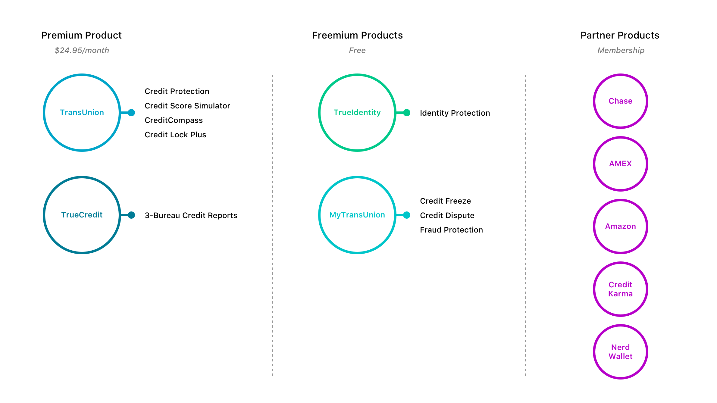
To help identify how the new MyTransUnion product fits among the other TransUnion touchpoints and partners, I illustrated our current landscape to help visualize to our team and stakeholders what the relationship and functionality would be in our ecosystem.
MVP User-Flow
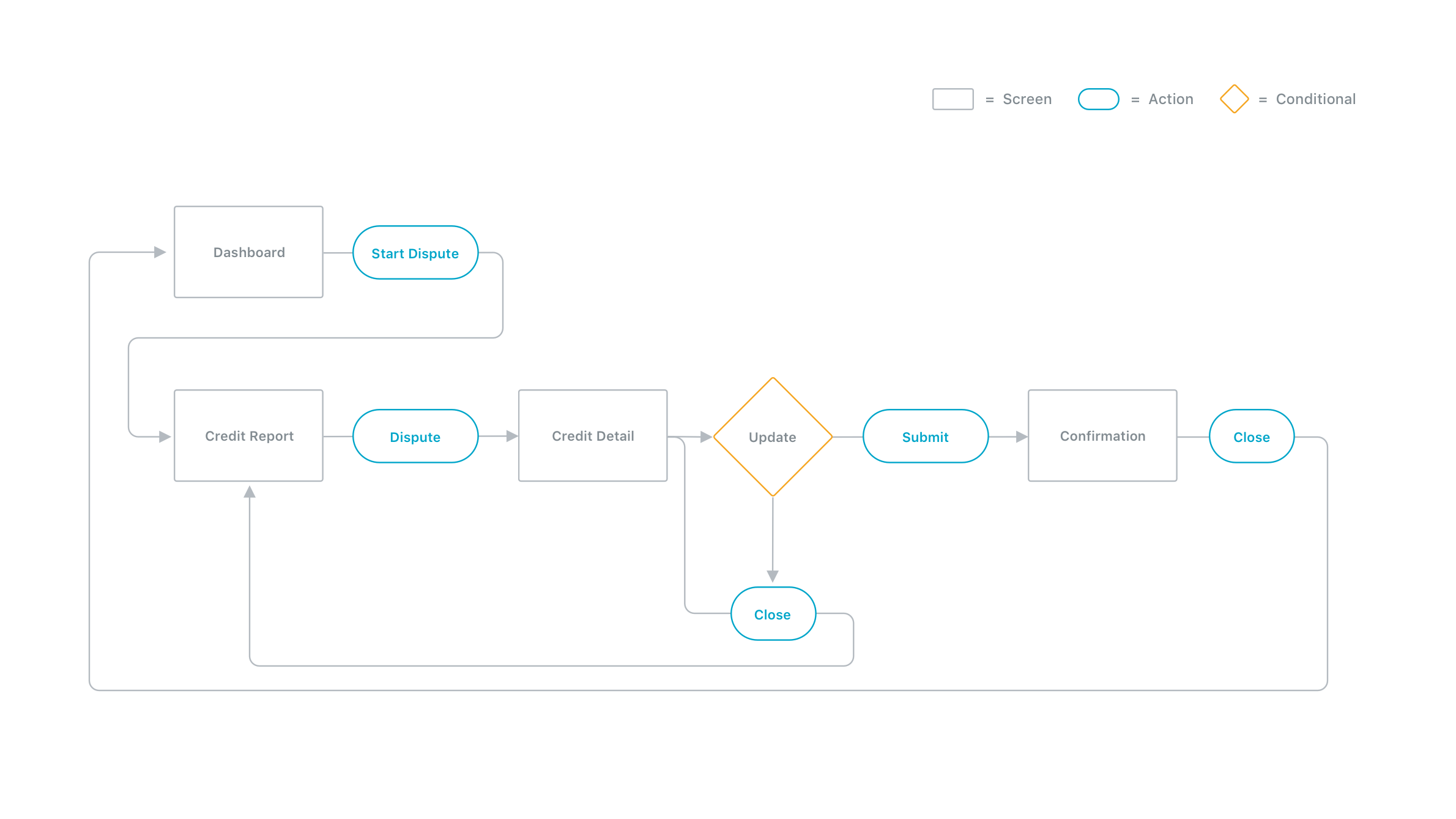
After identifying how the dispute experience would live within our product ecosystem, I then leveraged cross-functional relationships and data to establish an efficient user-flow for the MVP product that both followed the acceptance criteria as well as addressed technical restraints on the current platform.
Dashboard
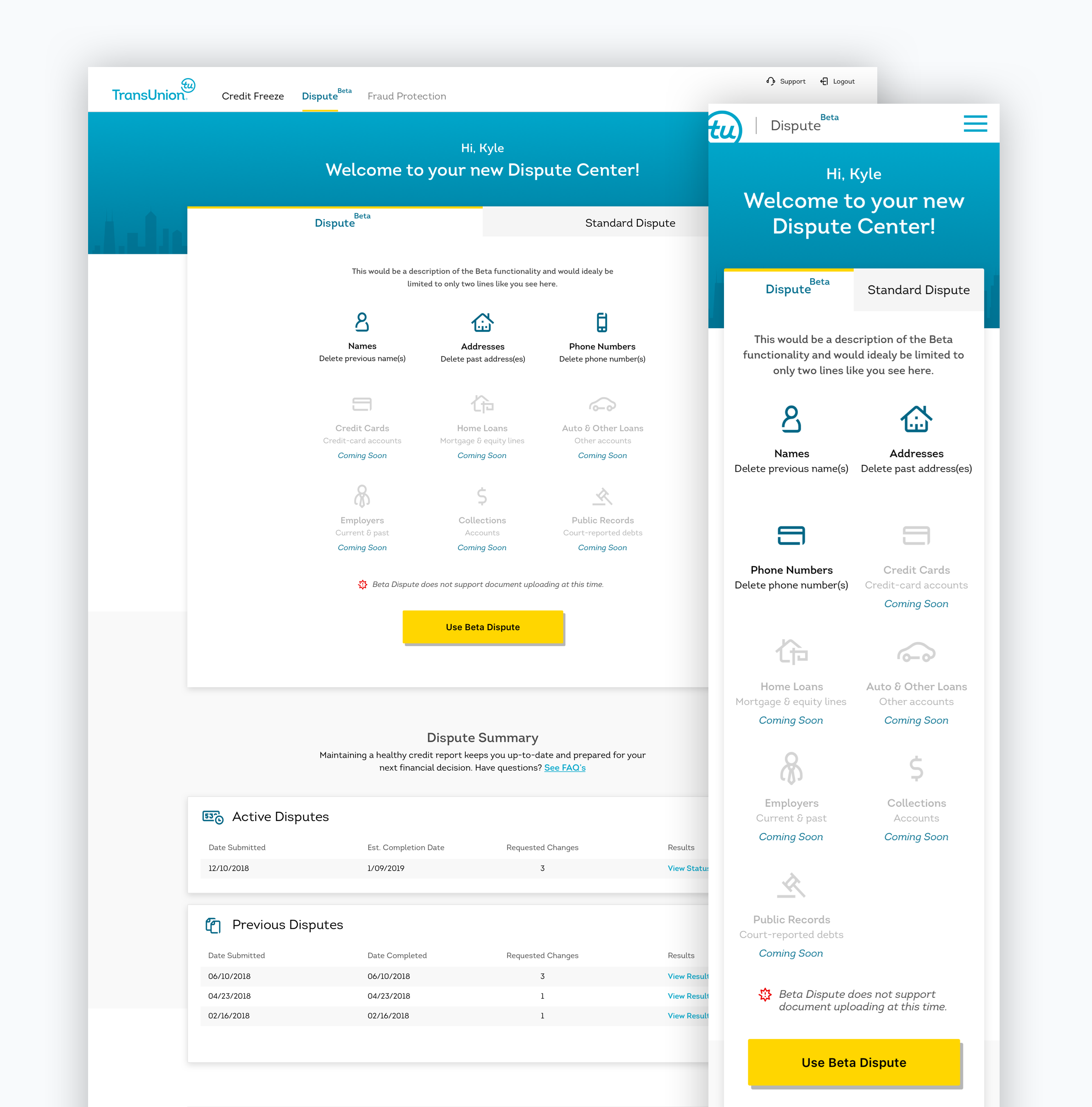
Leveraging the already established design language for the MyTransUnion product, we dove right into the visual design of the dispute experience. When designing the dashboard, there were a couple crucial pieces from the acceptance criteria that needed to be addressed. These include displaying both the beta and current dispute options to our users, dispute status and relevant credit education through FAQs and support.
Credit Report
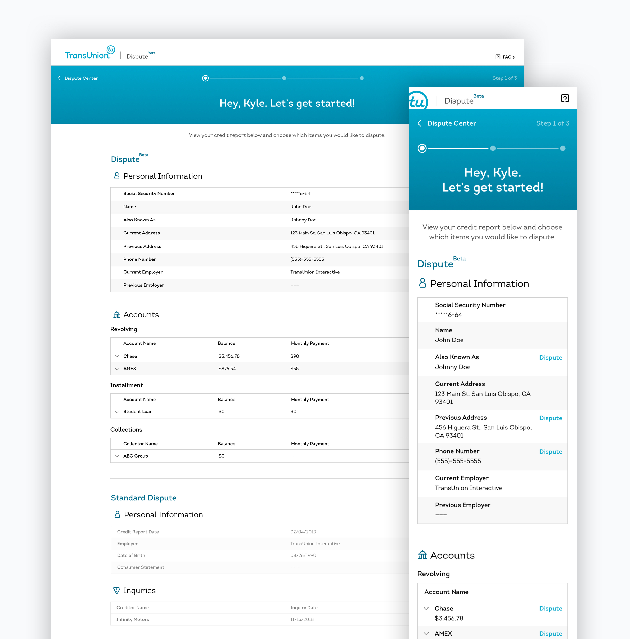
If users select to dispute credit items through the 'Beta' Dispute product, they are taken into a focused step-by-step experience to guide them through the entire dispute process. Users begin here where they are served their current TransUnion credit report. Users can identify which items need to be disputed and take action directly from their report.
Dispute Detail - Account Information
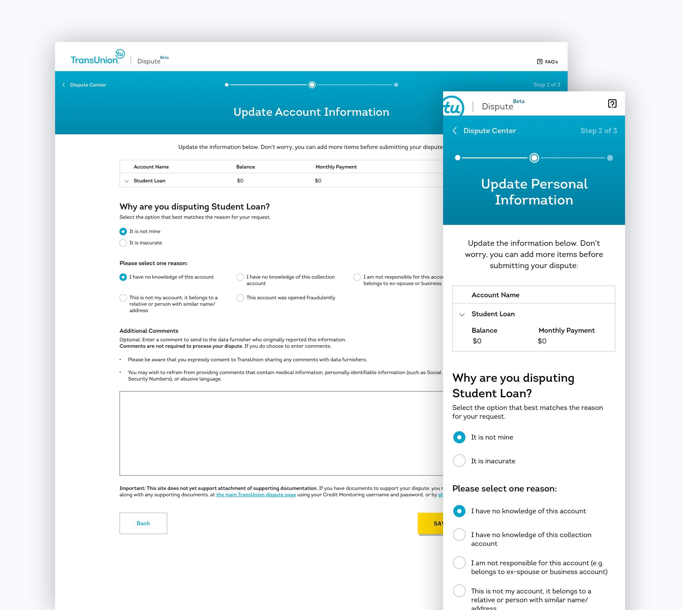
When selecting items from your credit report, the 'Beta' dispute process only supported a limited amount of dispute categories when first launched. One of those categories included account information such as credit cards. When disputing account information, we were required to ask and verify additional information before progressing the user forward. Here you can see a contextual experience – depending on how users answer, they will be served up relevant follow up questions or information to provide required data.
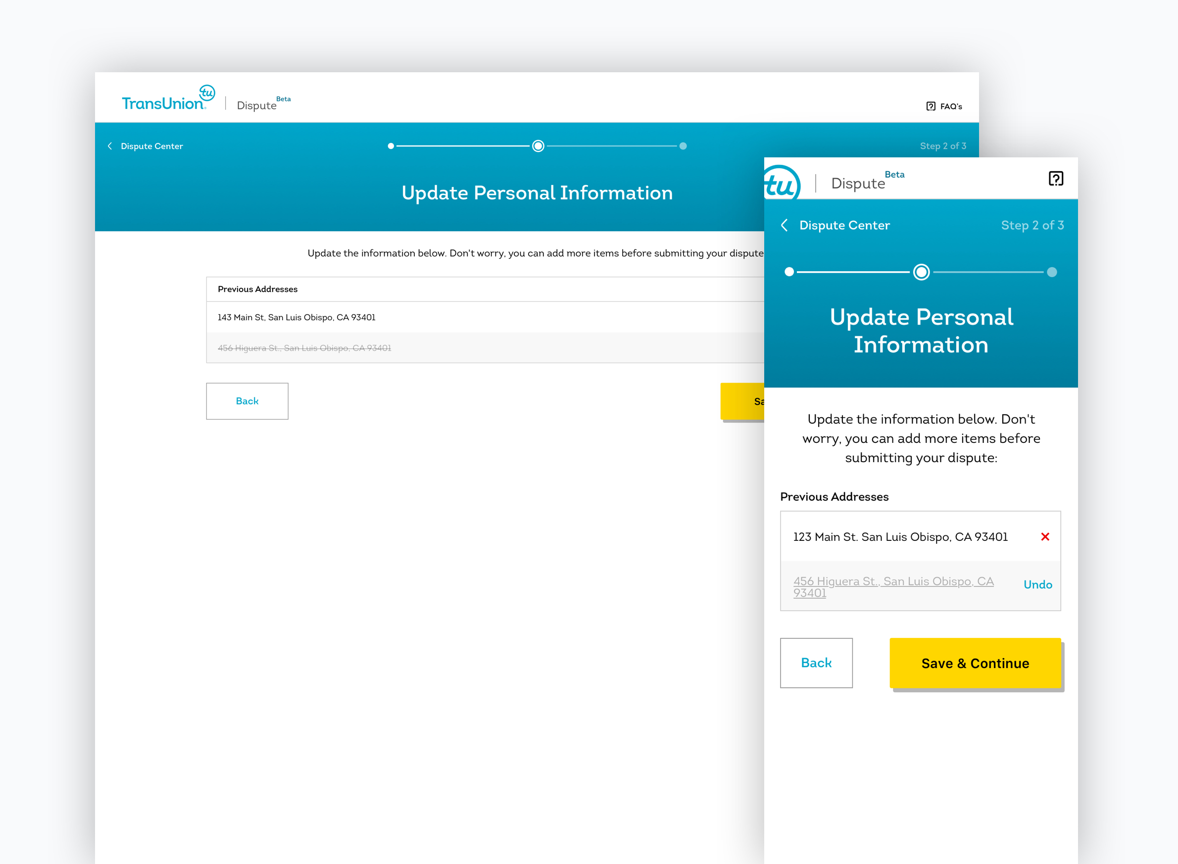
Dispute Detail - Personal Information
When disputing personal information, the ux of this flow was a little different. Here users need to be able to add, edit or delete personal information such as addresses. The 'Beta' experience initially did not allow for supporting document upload, but was a tool slotted to be an addition in the coming releases.
Review & Submit Dispute
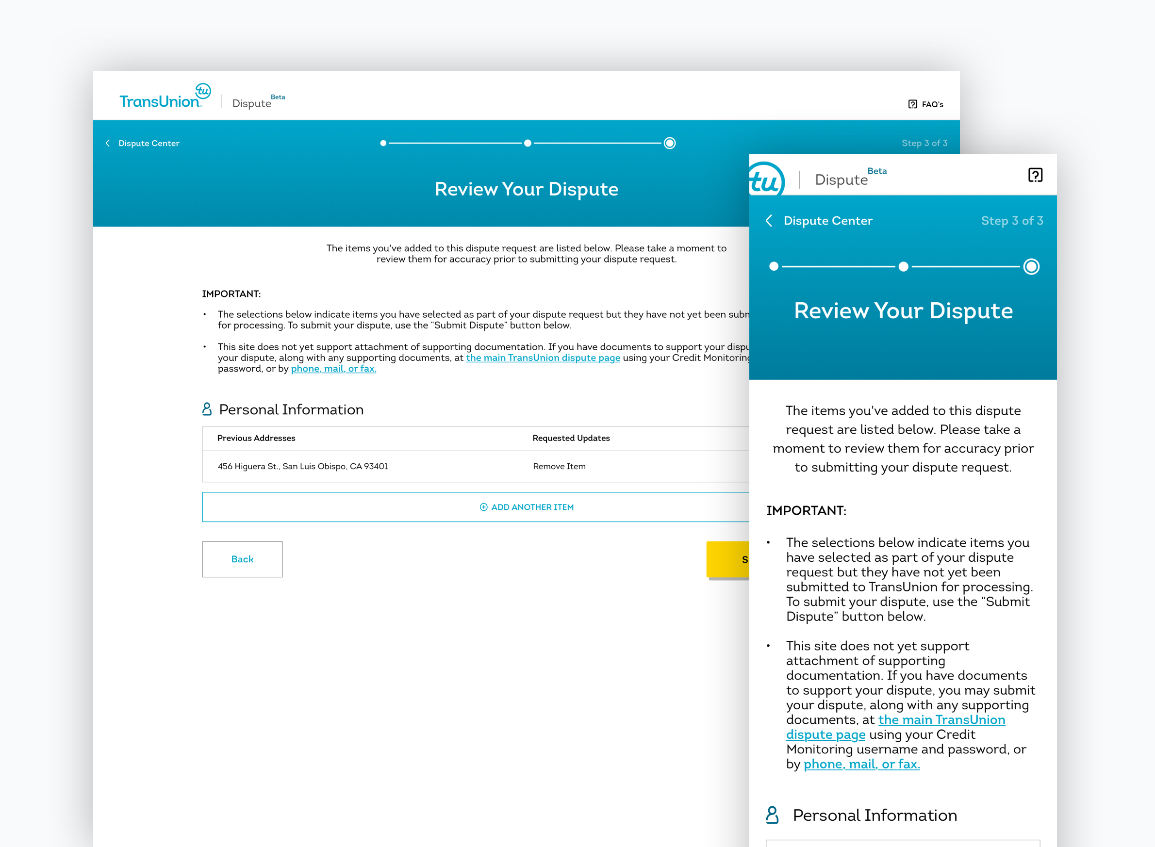
Once a user has completed their actions of disputing items from their report, they are shown the final step in the process – Review and Dispute. Here the user will be able to see a summary of the disputed items and changes requested as well as the option to add additional disputes to the case. Once they visually confirm their changes, users complete the process by pressing 'Submit Dispute'. Users from here are taken to their dashboard where they can watch for their results to populate within 30 days from the dispute date.
Future State
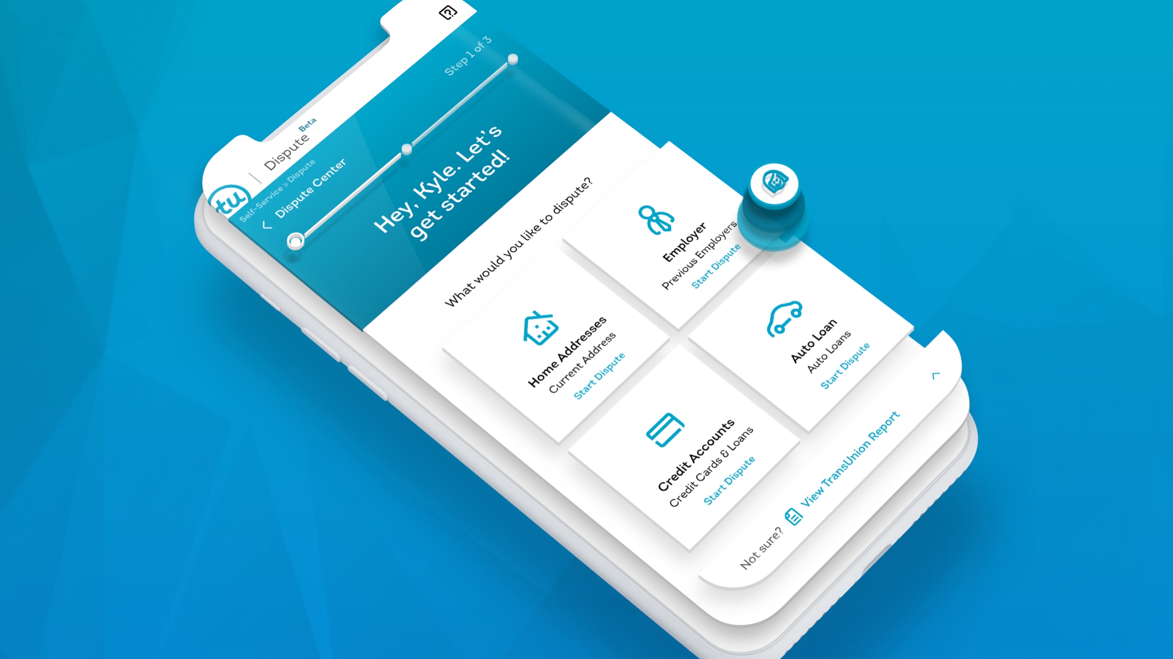
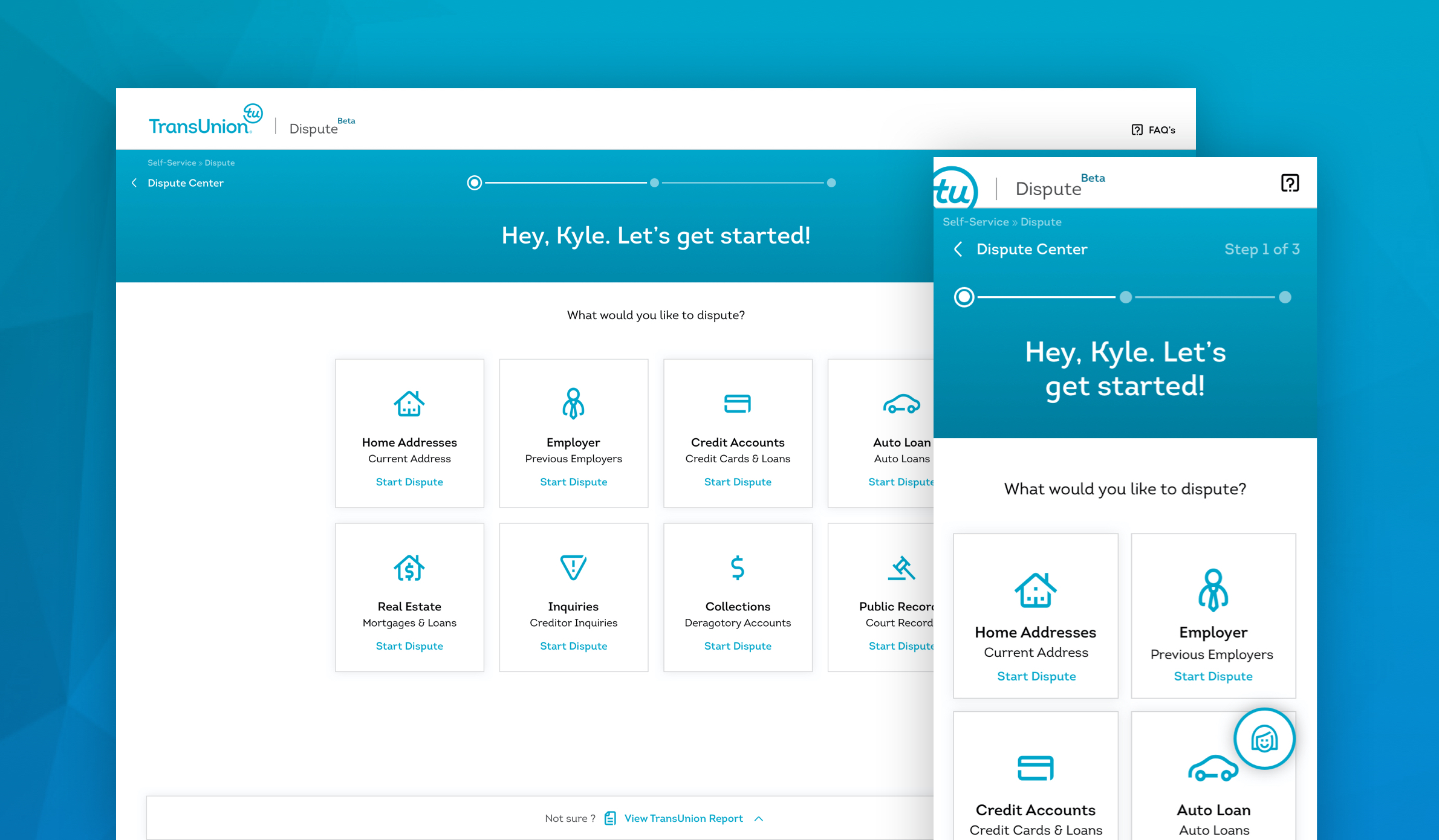
When conceptualizing a future state for the Dispute experience, I was inspired by the design thinking pattern of allowing users to more efficiently funnel themselves to their desired location to complete user tasks as quickly and as accurately as possible. In this future state, I am suggesting that pattern by presenting specific dispute situations and funneling them directly to the detail page. Also, I have created another ux pattern here by allowing users to still interact with their credit report if they are not sure. Users can see their report by pressing the 'View TransUnion Report' that is sticky to the bottom of their browser. This interaction slides a retractable sheet over the current categories displaying their report anytime throughout the process.
Another difference to note is the FAB that acts as a virtual assistant to help with FAQs and support regarding their dispute questions or experience.
Future Product Landscape
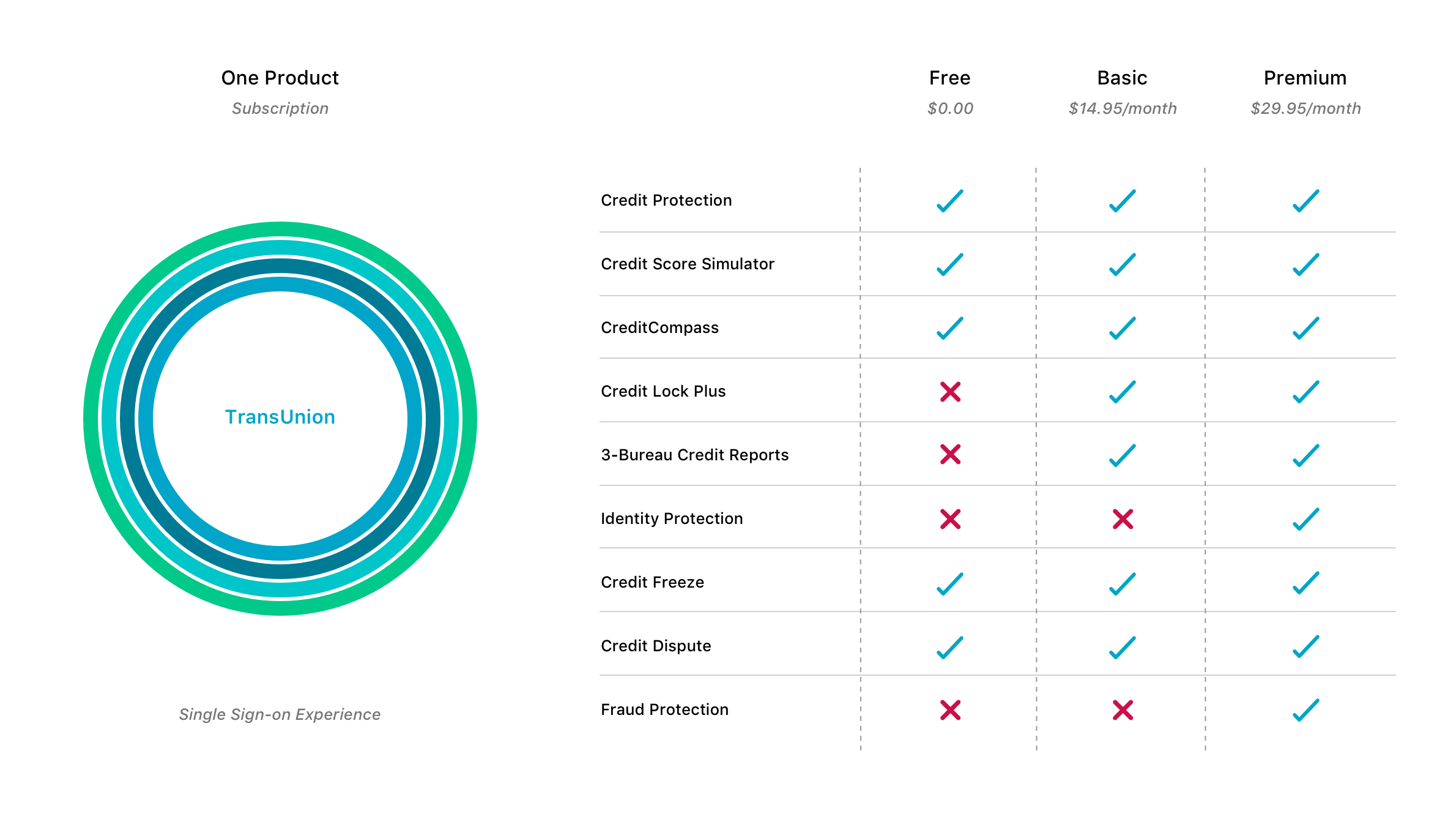
As I thought about the global vision for the MyTransUnion product, I couldn't help but start from the beginning by re-observing the current product landscape. Currently the TU ecosystem of digital tools and products are disconnected, require separate login and credential information and ultimately fall short of an expected user experience when searching for a brand that makes taking control of our credit and finances intuitive and efficient.
Because of this observation, I re-imagined the product landscape to include a single sign-on experience where all of the tools and services are offered under one umbrella. Users can now select from a more thoughtful subscription model that provides them with the functionality they need. This ecosystem also provides a significantly more cohesive personalized offer opportunity for our partners which is the driving revenue stream for TransUnion LLC.
Discover More Projects
Live your best user story.

